
Isaac Iniguez
Data Analyst | BI Developer
About Me
Hi, I’m Isaac Iniguez – a Data Analyst passionate about transforming raw data into actionable insights.I specialize in creating clear, impactful reports and visualizations that help businesses unlock the full potential of their data. My goal is to empower organizations to make smarter, data-driven decisions by analyzing trends, solving complex problems, and optimizing business strategies.With a Bachelor of Science in Business Administration and a Google Data Analytics Certification, I’ve spent over 100 hours honing my skills in Business Intelligence projects. My academic and professional experiences have equipped me with the expertise to turn data into a strategic asset for growth and innovation.Explore my portfolio to see how I apply my skills and knowledge to deliver results. Let’s connect and see how I can help your business thrive through data!
Skills

Excel | SQL | Python | Github | Tableau
Data Collection
Data Cleaning
Data Analytics
Data Visualization
Microsoft Office 365 / Google Drive
MacOS X / Windows
Pivot Tables / Charts
Presentations / PowerPoint
Featured Projects
SQL and Query Optimization
Spotify Dataset
Here I demonstrate my query skills with a dataset from Spotify where I answer business questions ranging from easy to advanced.


Python
Netflix dataset
This project uses Python to explore, analyze and visualize data from Netflix on Google Colab. Using powerful libraries like Pandas for data manipulation, NumPy for numerical computations, and Plotly for interactive visualizations.
Microsoft Excel
Bike Dataset From Kaggle
In this project, I cleaned, analyzed, and visualized a dataset using Excel. I created an interactive dashboard with pivot tables, formulas, and IF functions to uncover trends and insights.

Excel Dashboard
Coffee Business Dataset
Here I use Excel to transform fictitious coffee sales data into a interactive dashboard using pivot tables and pivot charts. Some of the formulas and functions I used include XLOOKUP, INDEX MATCH, Multiplication Formula for sales and Multiple IF functions.
Professional Certificates

Coursera Google Data Analytics Professional Certificate | Issued 2024
SQL | Spotify Dataset Project

This project involves analyzing a Spotify dataset with various attributes about tracks, albums, and artists using SQL. It covers an end-to-end process of normalizing a denormalized dataset, performing SQL queries of varying complexity, and optimizing query performance. Here I demonstrate advanced SQL skills and generate valuable insights from the dataset.Here are the questions I was interested in answering:
1) Retrieve the names of all tracks that have more than 1 billion streams.
2) List all albums along with their respective artists.
3) Get the total number of comments for tracks where licensed = TRUE.
4) Find all tracks that belong to the album type single.
5) Count the total number of tracks by each artist.
Medium Level
1) Calculate the average danceability of tracks in each album.
2) Find the top 5 tracks with the highest energy values.
3) List all tracks along with their views and likes where official_video = TRUE.
4) For each album, calculate the total views of all associated tracks.
5) Retrieve the track names that have been streamed on Spotify more than YouTube.
Advanced Level
1) Find the top 3 most-viewed tracks for each artist using window functions.
2) Write a query to find tracks where the liveness score is above the average.
3) Use a WITH clause to calculate the difference between the highest and lowest energy values for tracks in each album.
4) Find tracks where the energy-to-liveness ratio is greater than 1.2.
5) Calculate the cumulative sum of likes for tracks ordered by the number of views, using window functions.Query Optimization Technique
To improve query performance, we carried out the following optimization process:Initial Query Performance Analysis Using EXPLAIN- We began by analyzing the performance of a query using the EXPLAIN function.
- The query retrieved tracks based on the artist column, and the performance metrics were as follows:
Execution time (E.T.): 7 ms
Planning time (P.T.): 0.17 ms-To optimize the query performance, we created an index on the artist column. This ensures faster retrieval of rows where the artist is queried.
-After creating the index, we ran the same query again and observed significant improvements in performance:
Execution time (E.T.): 0.153 ms
Planning time (P.T.): 0.152 msTo see screen shots of the query performance before and after the indexing click on the link to the Github repository so that you can see the performance improvement.
Python |Netflix Dataset

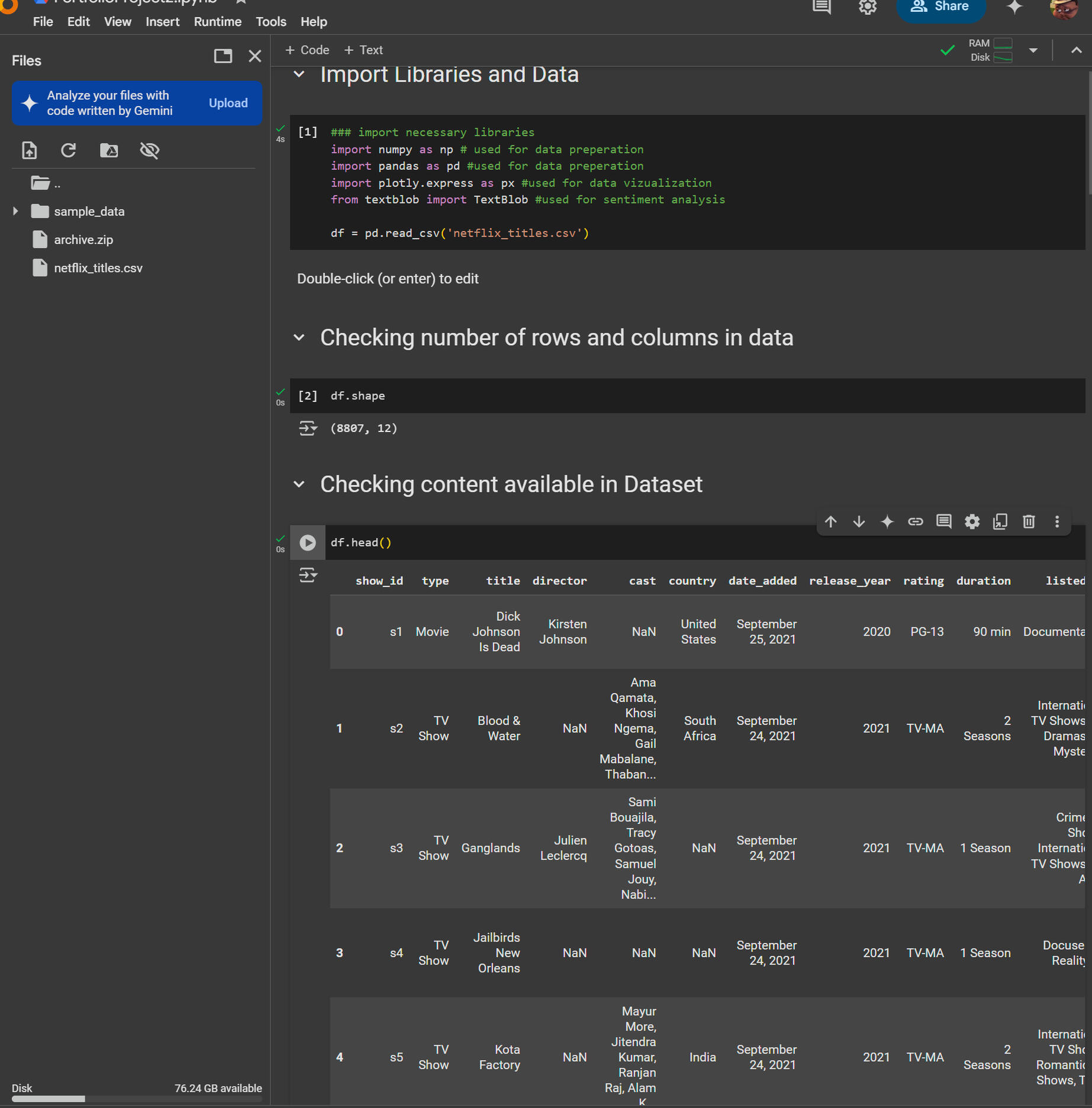
Summary of the Netflix Data Analysis Project Using PythonThis project demonstrates how to perform data analysis on a Netflix dataset using Python. The project involves cleaning the data, analyzing content distribution, identifying top actors and directors, and performing sentiment analysis on content descriptions. Below is a step-by-step breakdown of the process:---Step 1: Setting Up the Environment
1. Dataset: The dataset, netflix_titles.csv, was downloaded from Kaggle. It contains information about Netflix titles, including type (movie/TV show), title, director, cast, country, release year, rating, duration, and description.
2. Tools: Google Colab was used for the analysis, with the following Python libraries:
- NumPy: For numerical computations.
- Pandas: For data manipulation and analysis.
- Plotly Express: For data visualization.
- TextBlob: For sentiment analysis.---
Step 2: Loading and Exploring the Data
1. Import Libraries:
- Imported necessary libraries: numpy, pandas, plotly.express, and textblob.
2. Load Dataset:
- Used pandas to load the dataset: df = pd.read_csv('netflix_titles.csv').
3. Data Overview:
- Checked the shape of the dataset: df.shape (8807 rows, 12 columns).
- Previewed the first few rows using df.head() to understand the structure of the data.---
Step 3: Data Cleaning
1. Handling Missing Values:
- Replaced missing values in the director and cast columns with "Director Not Specified" and "Cast Not Specified," respectively.
2. Data Preparation:
- Created separate data frames for directors and actors to analyze their contributions.---Step 4: Analyzing Content Distribution
1. Content Ratings:
- Grouped the data by rating and counted the number of titles in each category.
- Created a pie chart using Plotly Express to visualize the distribution of content ratings on Netflix.
- Key Insight: The majority of content is rated TV-MA (Mature Audiences), followed by TV-14.---Step 5: Analyzing Top Directors and Actors
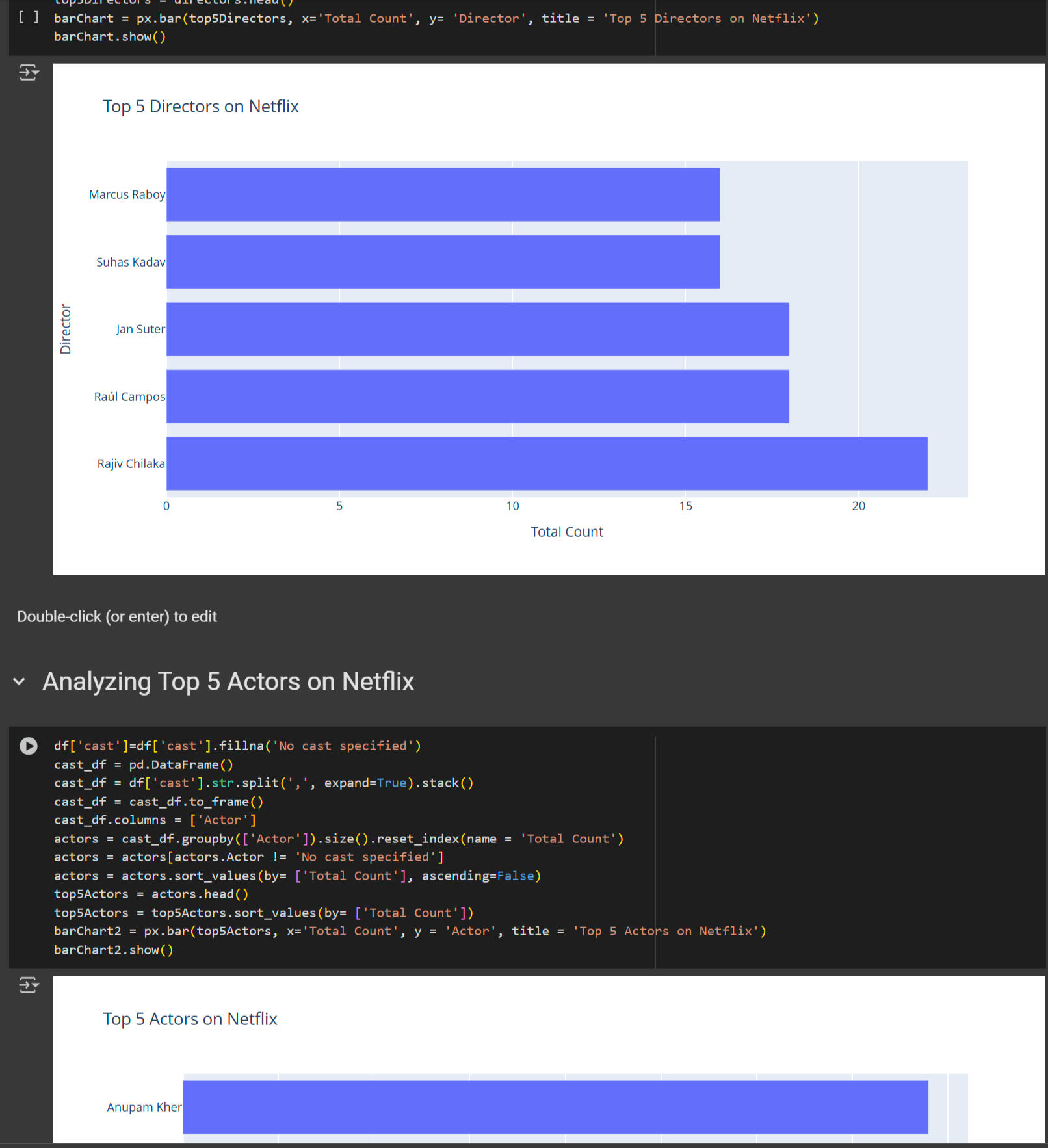
1. Top Directors:
- Grouped the data by director and counted the number of titles each director contributed.
- Sorted the directors by the number of titles in descending order.
- Created a horizontal bar chart to visualize the top 5 directors on Netflix.
- Key Insight: Rajiv Chilaka and Jan Suter are among the top directors with the most content.
2. Top Actors:
- Extracted actor names from the cast column and counted their appearances.
- Sorted the actors by the number of titles in descending order.
- Created a horizontal bar chart to visualize the top 5 actors on Netflix.
- Key Insight: Anupam Kher and Rupa Bhimani are among the top actors with the most content.---
Step 6: Analyzing Content Trends Over Time
1. Content Production by Year:
- Grouped the data by release_year and type (movie/TV show) to analyze content production trends.
- Created a line chart to visualize the number of movies and TV shows released each year.
- Key Insight: Content production has significantly increased since 2015, with movies being more prevalent than TV shows.---Step 7: Sentiment Analysis
1. Sentiment Analysis on Descriptions:
- Used TextBlob to analyze the sentiment of content descriptions.
- Categorized sentiment as positive, negative, or neutral based on polarity scores.
- Grouped the data by release_year and sentiment to analyze sentiment trends over time.
- Created a bar chart to visualize the distribution of positive, negative, and neutral content by year.
- Key Insight: Netflix produces more positive content than negative or neutral content.---
Step 8: Conclusion
- The project provides insights into Netflix's content distribution, top contributors (directors and actors), production trends, and sentiment analysis.
- The analysis can be extended further by exploring genre distribution, country-specific content, and more advanced visualizations.---Key Takeaways
- Data Cleaning: Handled missing values and prepared the data for analysis.
- Visualization: Used Plotly Express to create insightful charts (pie charts, bar charts, line charts).
- Sentiment Analysis: Leveraged TextBlob to analyze the sentiment of content descriptions.
- Insights: Identified trends in content production, top contributors, and the overall sentiment of Netflix content.This project is a great addition to a portfolio, showcasing skills in data cleaning, analysis, visualization, and sentiment analysis using Python.
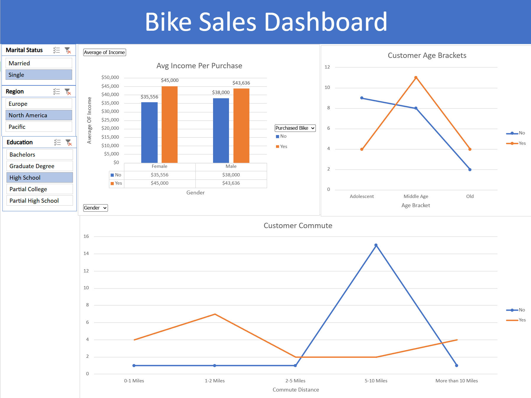
Excel| Pivot Tables, Dashboard and Visualizations using Bike data

In this project, I created a complete Excel project, starting with raw data, cleaning it, and building an interactive dashboard with visualizations and filters. Below is a step-by-step breakdown of the process:---Step 1: Setting Up the Project
1. Data Overview: The dataset contains information about bike buyers, including demographics (age, gender, income, education, etc.) and whether they purchased a bike.
2. Create Sheets: - Raw Data Sheet: Keeps the original data untouched.
- Working Sheet: A copy of the raw data for manipulation.
- Dashboard Sheet: For final visualizations.
- Pivot Table Sheet: For creating pivot tables to power the dashboard.---
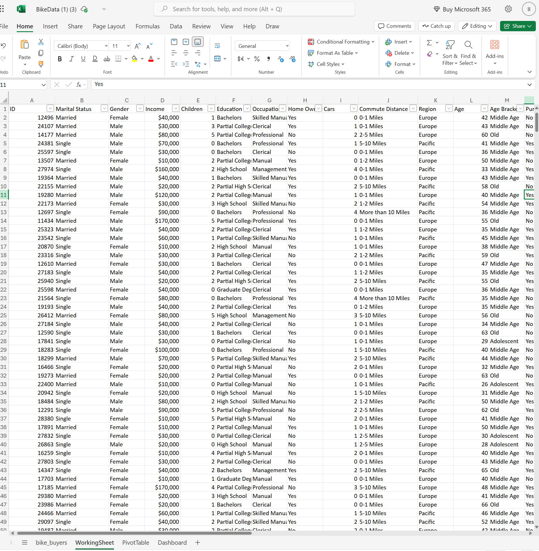
Step 2: Data Cleaning
1. Remove Duplicates:
- Used the "Remove Duplicates" feature to eliminate redundant rows.
2. Standardize Data:
-Replaced abbreviations (e.g., "M" for "Married," "S" for "Single," "F" for "Female," "M" for "Male") with full words for clarity.
-Formatted income as currency for consistency.3. Create Age Brackets:
-Added a new column for age brackets using nested IF statements:Adolescent: 30 or younger.Middle Age: 31–54.Old: 55+.Step 3: Building Pivot Tables
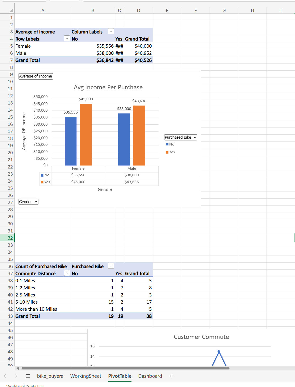
1. Average Income by Gender and Purchase Status:
- Created a pivot table to show average income for males and females who did or did not buy a bike.
- Visualization: A 3D bar chart showing income differences.
2. Commute Distance Analysis:
- Analyzed commute distances and their relationship to bike purchases.
- Visualization: A bar chart showing purchase counts by distance.
- Fixed formatting issues (e.g., "10+ miles" was rephrased to ensure proper sorting).
3. Age Brackets and Purchases:
- Created a pivot table to show bike purchases by age brackets.
- Visualization: A line chart highlighting trends (e.g., middle-aged buyers purchased more bikes).---
Text
Step 4: Designing the Dashboard
1. Organize Visualizations:
- Copied charts from the pivot table sheet to the dashboard sheet.
- Aligned and resized charts for a clean layout.
2. Remove Gridlines:
- Disabled gridlines for a polished look.
3. Add a Header:
- Created a merged cell at the top with the title "Bike Sales Dashboard."
4. Color Coordination:
- Applied consistent colors across charts for a professional appearance.---Step 5: Adding Interactive Filters
1. Insert Slicers:
- Added slicers for marital status, region, and education to filter data across all visualizations.
2. Connect Slicers to Pivot Tables:
- Used "Report Connections" to link slicers to all pivot tables, enabling dynamic filtering.---Step 6: Final Touches
1. Review and Refine:
- Adjusted chart titles, axis labels, and data labels for clarity.
- Experimented with different chart styles to improve readability.
2. Hide Unnecessary Sheets:
- Hid the raw data and pivot table sheets to keep the dashboard clean and user-friendly.---Key Takeaways
- The project demonstrates how to clean data, create pivot tables, and build an interactive dashboard in Excel.
- Key skills include data cleaning, pivot tables, chart creation, and using slicers for interactivity.
- The final dashboard provides insights into bike buyer demographics, income, and purchasing behavior, with the ability to filter by marital status, region, and education.This project is how I show my experience and knowledge off using Excel in a business application and is great addition to my portfolio, showcasing Excel proficiency and the ability to turn raw data into actionable insights.
Excel| Interactive Dashboard using Coffee Sales Data

Summary of the Excel Coffee Sales Dashboard ProjectThis is documentation of an interactive Coffee Sales Dashboard in Excel. The project involves gathering and transforming data, creating pivot tables and charts, and building a dynamic dashboard with slicers and a timeline. Below is a step-by-step breakdown of the process:
---Step 1: Data Gathering and Transformation
1. Dataset Overview:
- The dataset contains coffee sales data with columns like Order ID, Order Date, Customer ID, Product ID, Quantity, and additional columns for customer and product details.
- Data is spread across three tables: Orders, Customers, and Products.2. Lookup Customer Data:
- Used XLOOKUP to populate customer-related columns (Customer Name, Email, Country) in the Orders table.
- Example formula for Customer Name:
excel
 =XLOOKUP(C2, Customers!A:A, Customers!B:B, "", 0)
- Handled missing values (e.g., blank emails) using an IF statement to replace zeros with blanks.3. Lookup Product Data:
- Used INDEX-MATCH to dynamically populate product-related columns (Coffee Type, Roast Type, Size, Unit Price) in the Orders table.
- Example formula for Coffee Type:
excel
 =INDEX(Products!A:E, MATCH(D2, Products!A:A, 0), MATCH(I$1, Products!1:1, 0))
- This formula dynamically adjusts as it is dragged across columns.4. Calculate Sales:
- Created a Sales column by multiplying Unit Price by Quantity:
excel5. Format Data:
=L2*E2
- Formatted Order Date to display day, abbreviated month, and year (e.g., 05-Sep-2023).
- Formatted Size to include units (e.g., 1.0 kilo).
- Formatted Unit Price and Sales as US dollars.6. Remove Duplicates:
- Checked for and removed duplicate rows using the Remove Duplicates feature.7. Convert to Table:
- Converted the data range into an Excel table (Ctrl + T) for easier data management and automatic updates to pivot tables.---
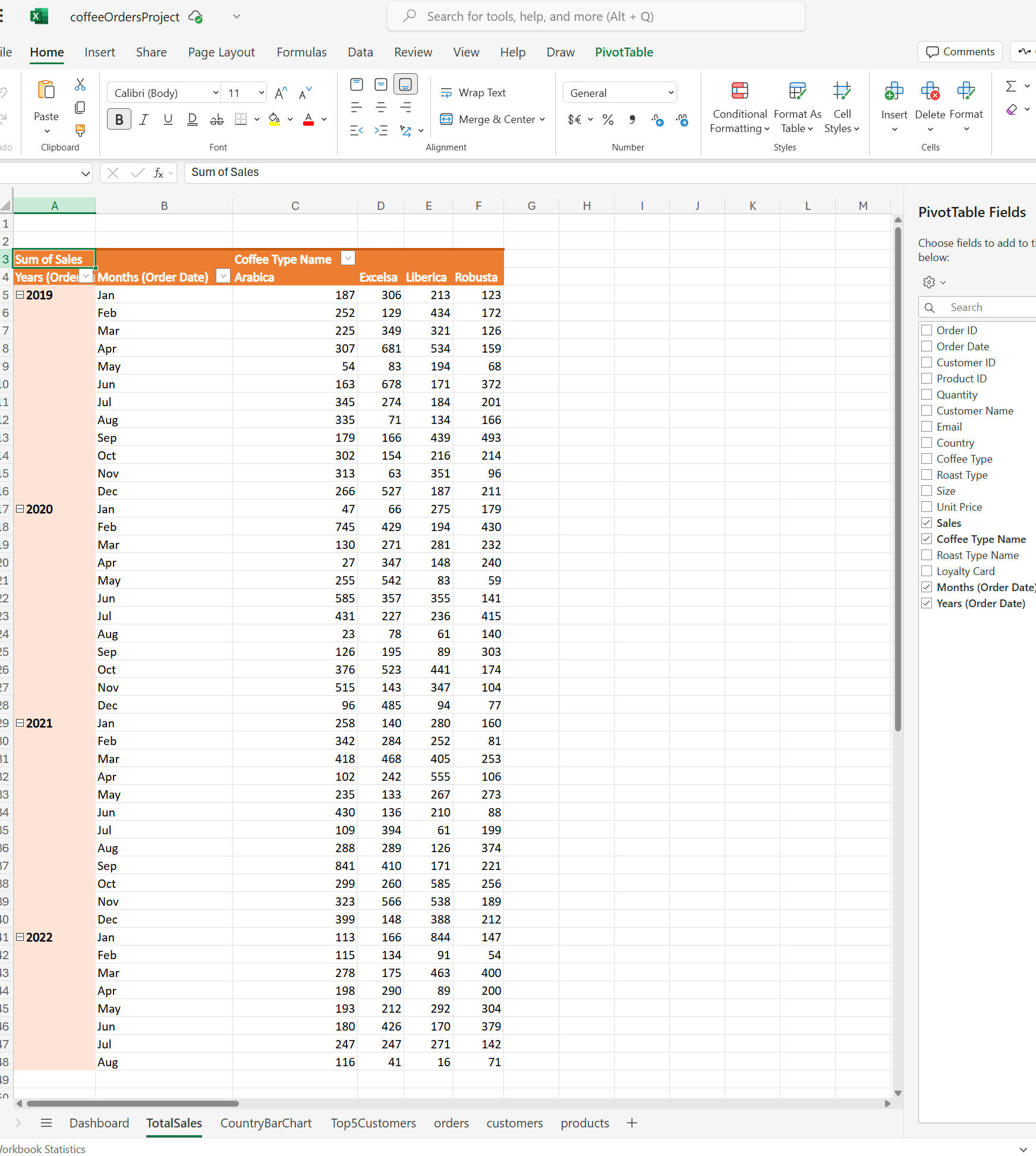
Step 2: Creating Pivot Tables and Charts
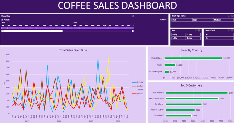
1. Total Sales Over Time (Line Chart):
- Created a pivot table with Order Date (grouped by year and month) in rows and Coffee Type in columns.
- Added Sales to values and formatted it as US dollars.
- Inserted a Line Chart to visualize sales trends over time.
- Customized the chart with colors, axis titles, and a chart title (Total Sales Over Time).2. Sales by Country (Bar Chart):
- Created a pivot table with Country in rows and Sales in values.
- Inserted a Bar Chart to compare sales across countries.
- Customized the chart with different colors for each country and added data labels.3. Top 5 Customers (Bar Chart):
- Created a pivot table with Customer Name in rows and Sales in values.
- Applied a Top 5 Filter to show only the top 5 customers by sales.
- Inserted a Bar Chart and customized it with colors and data labels.---
Step 3: Adding Interactivity
1. Timeline:
- Inserted a Timeline for Order Date to filter data by specific time periods.
- Customized the timeline with a purple theme and white text.2. Slicers:
- Inserted slicers for Roast Type, Size, and Loyalty Card.
- Connected slicers to all pivot tables and charts using Report Connections.
- Customized slicers with a purple theme and white text.---
Step 4: Building the Dashboard
1. Dashboard Layout:
- Created a new worksheet named Dashboard.
- Added a header (Coffee Sales Dashboard) with a purple background and white text.
- Removed gridlines for a clean look.2. Adding Visuals:
- Copied and pasted the Line Chart, Bar Charts, Timeline, and Slicers onto the dashboard.
- Arranged visuals neatly and adjusted their sizes.3. Final Touches:
- Tested interactivity: ensured that the timeline and slicers filtered all visuals dynamically.
- Removed unnecessary elements (e.g., formula bar, scroll bars, sheet tabs) for a polished dashboard appearance.---Key Features of the Dashboard
- Dynamic Visuals: The line chart, bar charts, and slicers update in real-time based on user interactions.
- Interactivity: Users can filter data by date, roast type, size, and loyalty card status.
- Customization: The dashboard is visually appealing with a consistent purple theme and clear labels.---Key Takeaways
- Data Transformation: Used XLOOKUP and INDEX-MATCH to gather and clean data from multiple tables.
- Pivot Tables and Charts: Created pivot tables and charts to analyze sales trends, top customers, and sales by country.
- Dashboard Design: Built an interactive and visually appealing dashboard using slicers, timelines, and custom formatting.